Photography byRoland Bello,Words bySpencer Bailey,Produced byKate Berry
PublishedMay 27, 2026 1:00 AM EDT
We may earn revenue from the products available on this page and participate in affiliate programs.
Sign Up for Domino’s Newsletter
Sign Up for Domino’s Newsletter
By signing up, you confirm you are 16+, will receive newsletters and promotional content and agree to ourTerms of Useand acknowledge the data practices in ourPrivacy Policy. You may unsubscribe at any time.
A firm believer in the restorative powers of aesthetics, color, and sound (and something of a shaman herself), Ivy Ross is not your typical tech executive. But her spiritual bent is hardly idle fantasy. From her office at Google’s Design Lab in Mountain View, California, the company’s level-headed vice president of hardware design means business.
There, she guides a team of 150 in crafting some of today’s most distinctive gadgets, from phones to smart speakers. Since unveiling its hardware line in the fall of 2016, Google has swiftly built a reputation for soft, simple, and strikingly attractive products that thoughtfully blend color (often pastel, some that pop), material (textiles above all), and form (nature-inspired) into surprisingly pleasing results.
Forget glossy, hard-edged black boxes. Ross and her colleagues craft playful pieces meant to fit into their surroundings (or, in the case of the Pixel phone, our lives). We dropped by the 70,000-square-foot studio to learn how, in a relatively short stretch, they’ve built such a strong signature look.
In 2015, as Google assembled its in-house hardware unit, roughly 25 staffers—including Ross and Isabelle Olsson, now director of design for home, wearables, and color—headed off-site for a brainstorming retreat. Their mission? To clearly and succinctly define the Google hardware aesthetic.
In the end, the team landed on three words: human, optimistic, and bold. Ross, who began her career as a jewelry artist before moving through marketing and development roles at Calvin Klein, Mattel, and Gap, understood how essential the exercise was. “Before you attempt something like this,” she says, referring to building a product line for a global brand from scratch, “there has to be a shared vision and connectivity. Especially when you let people loose to work across categories. We really tried to give form to what we were talking about.”
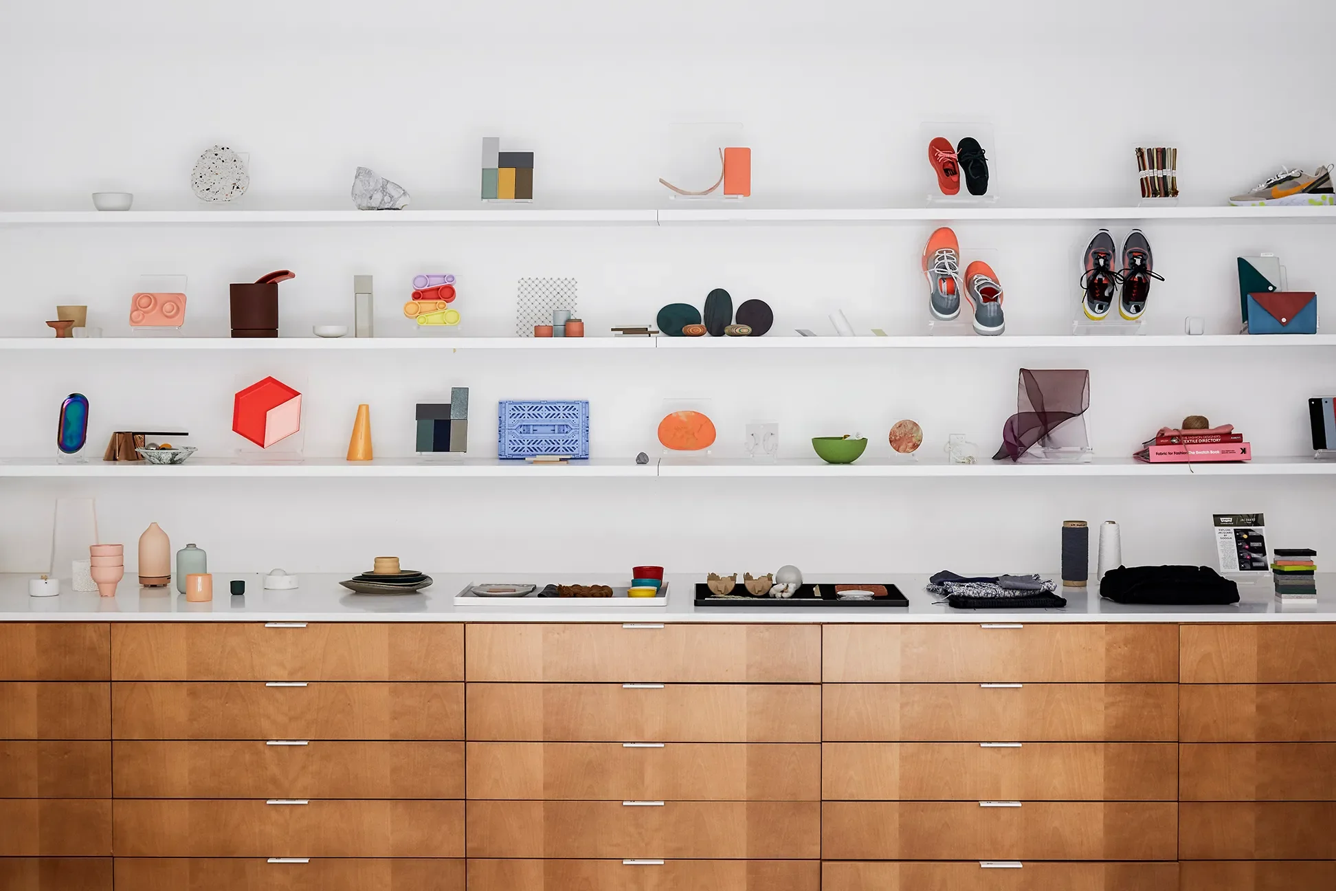
That thinking is evident the moment you step inside the team’s new HQ, a light-filled, airy two-story sanctuary they moved into in 2018. Organized into labs—one for color, another for materials—the space embodies the Ross ethos: warm, welcoming, open. “People forget technology can be cozy,” says Philip Battin, head of special projects. “Our building doesn’t feel like a hospital; in some ways it feels like a home.”
What’s the trending shade of 2020? “Blue is very appealing right now. Unconsciously, it’s a calming color when things are chaotic,” explains Ross, adding that it may also stem from “a lot of talk around sustainability and oceans.” On the whole, Google’s palettes have been ahead of the curve. Take coral, which the company used in its first Home Mini (released in fall 2017) and was later named Pantone’s 2019 color of the year (this year’s Pantone pick is classic blue). Likewise, inspiration at the materials lab comes from beyond the tech world. “What’s going on in furniture and shoes and things like that,” says Battin of their cross-disciplinary approach. “It gets really exciting, because that can help push the aesthetics of what we do.”
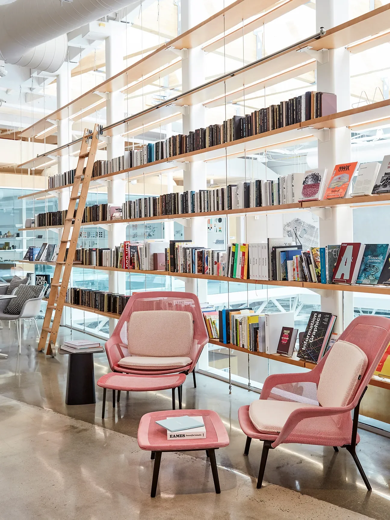
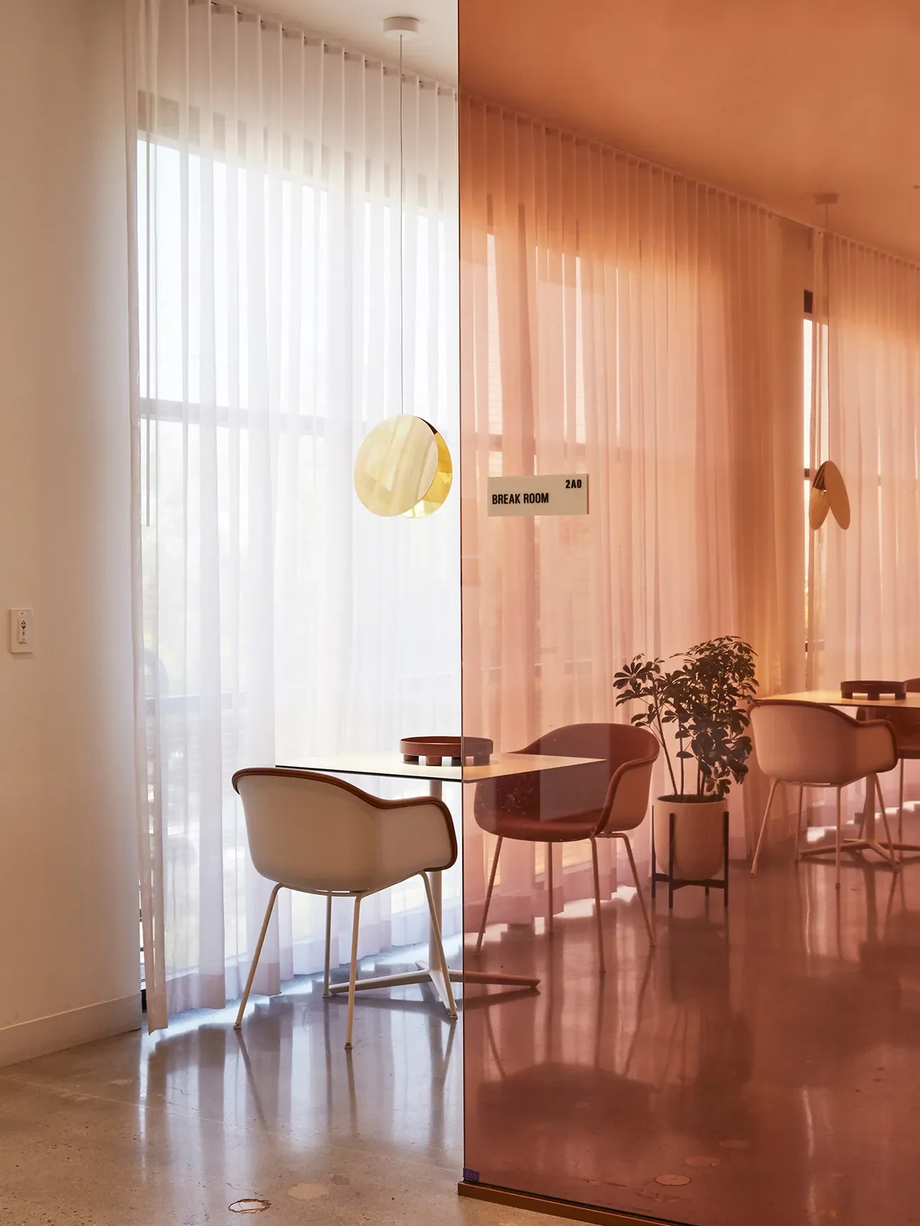
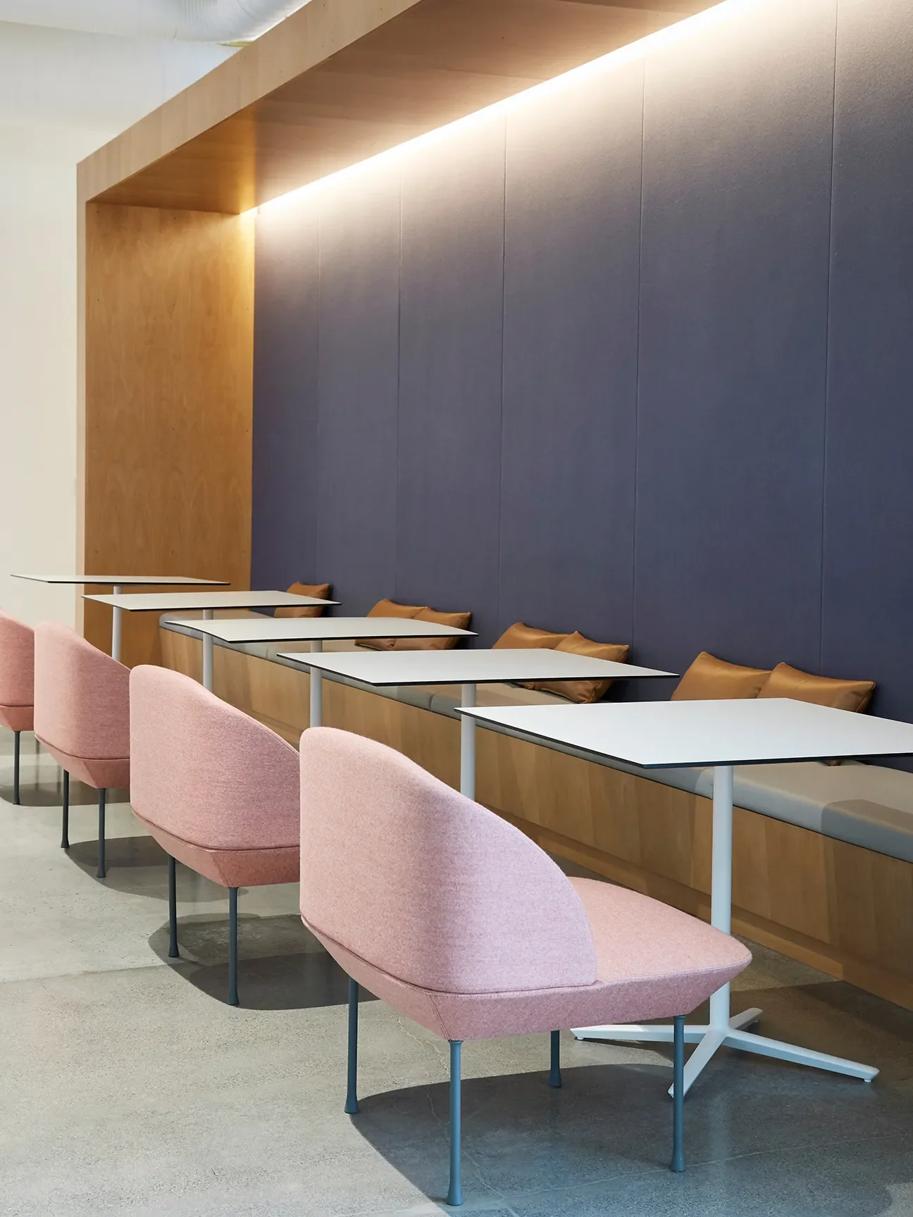
The design avoids the cubicle culture of many other Google offices, opting instead for soothing colors and birchwood accents, living-room-style lounges furnished with Muuto and Knoll, tinted glass partitions that admit plenty of natural light, open-plan desks, and a library stocked with employees’ favorite books—the kind of personal touches rare in a large corporation. Marguerite Bergman, [the former] head of packaging design, adds that the office sparks creativity: “Everything is visible—nothing is locked away. We’re very transparent in how we share our work.” (Because so many top-secret concepts sit out in the open, the building is under exceptionally tight security.)
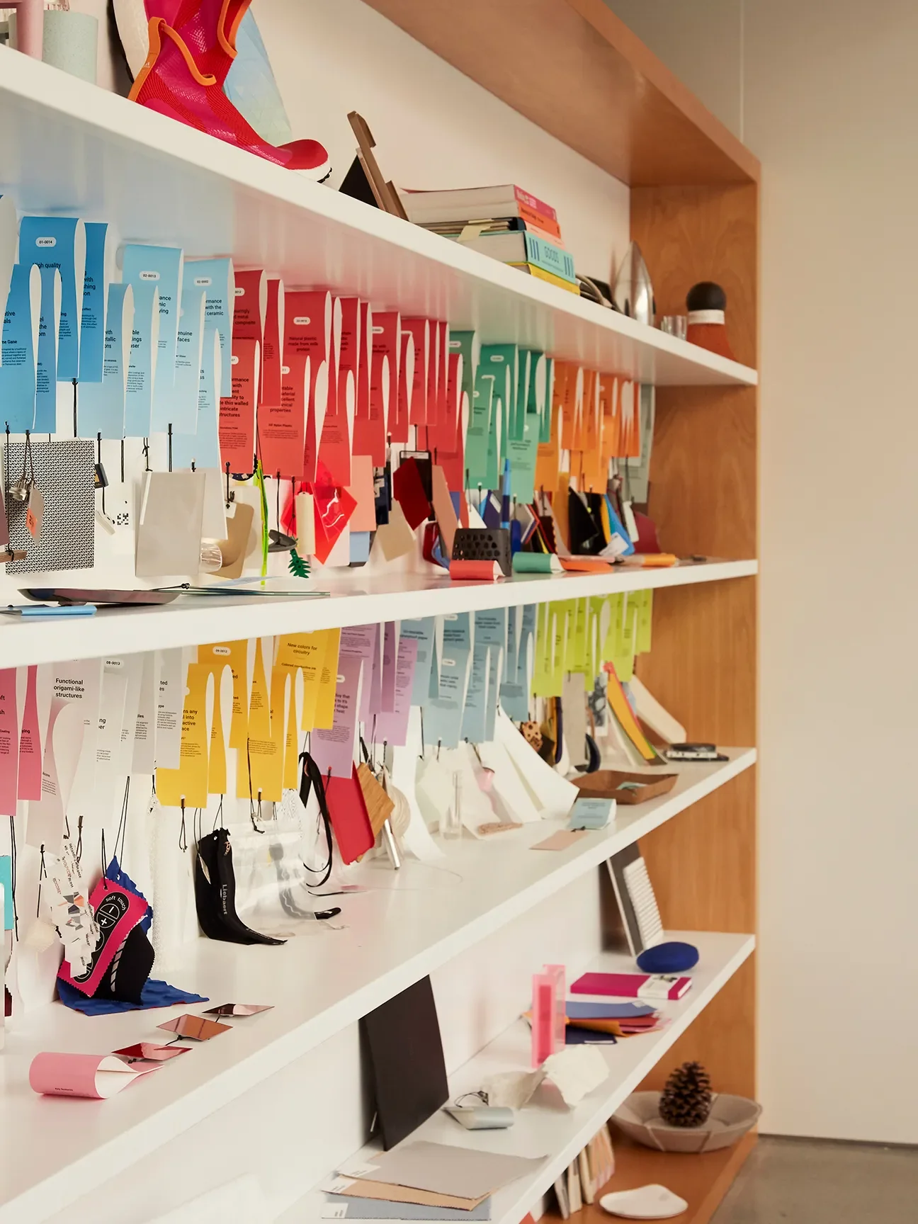
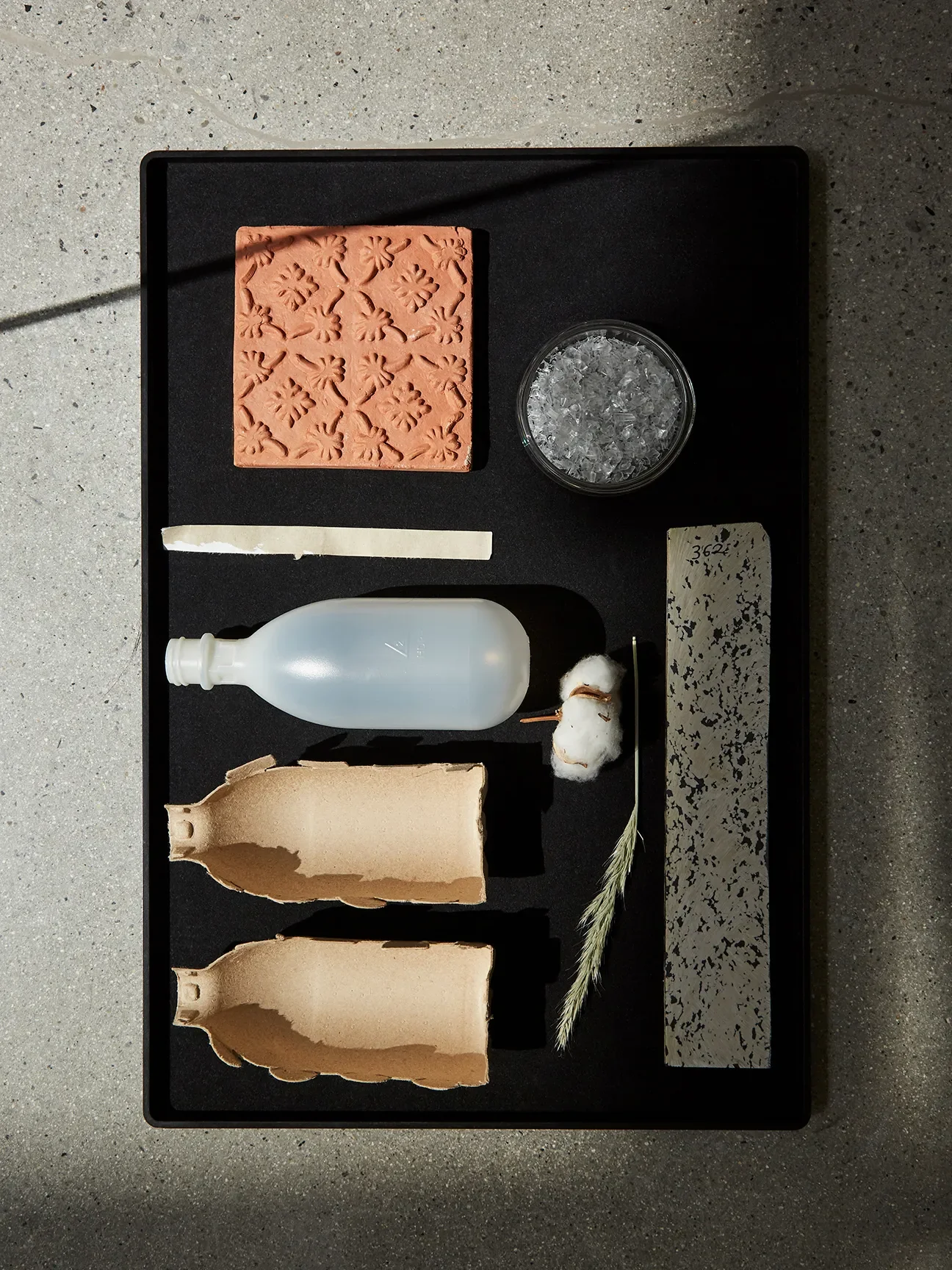
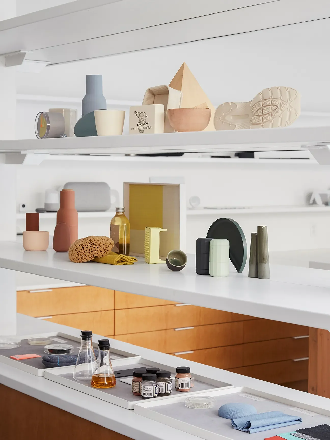
While the inventive use of textiles in Google’s products certainly helps them stand out (the materials lab houses more than 1,000 swatches), the company’s subtle yet idiosyncratic color choices have proven especially central. Olsson says questions like “How do we harmonize?” have guided their process. “But also: ‘How do we pop?’ We always want an expressive option.”
Whether it’s a purplish Pixel 3A smartphone, a coral Google Nest Mini, or a wasabi-hued button on the Stadia controller, Google’s often-adventurous palette makes refreshingly unconventional statements. Going bold was also a way to grab attention—an important factor, according to Ross, because “we were late to the game in terms of electronics.” Max Yoshimoto, [the former] director of consumer hardware industrial design, elaborates: “When we started looking at color accents and pops, it clearly became a thing for us that was unique. Nobody else was really doing it.”
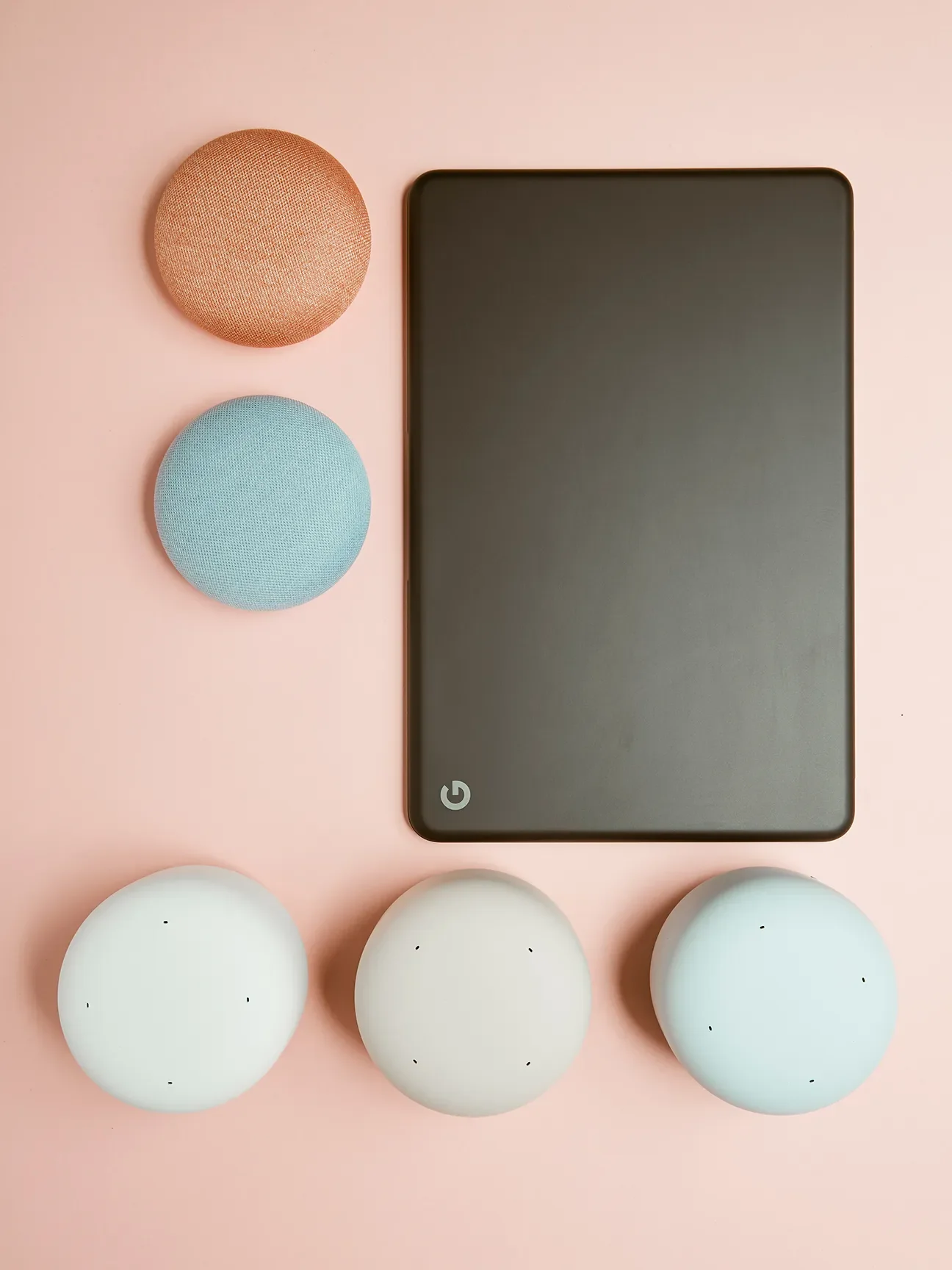
Still, that direction broke from expectations: In a twist, the hardware colorways—such as aqua, chalk, charcoal, sand, and sky—are in no way an extension of Google’s primary-hued logo. “A lot of people ask, ‘Why are the products not red, blue, green, and yellow?’” says Olsson. For Ross and Olsson, it was vital to stay rooted in the brand’s DNA without being too literal, and to build a wholly distinctive palette.
Their approach appears to be working. The company’s CEO, Sundar Pichai, was using the Pixel phone in public shortly after it launched when someone approached him—not knowing who Pichai was—and asked, “Is that the new Google phone?” They’d spotted the device’s bright orange button on the back. Essentially, the team’s color development is “a reflection of what society is feeling at the time,” says Ross. “We genuinely believe we can convey optimism.”
With a background in fashion and psychology (she minored in the latter at New York’s Fashion Institute of Technology), Ross is constantly scanning for cultural cues about what’s new, next, and fresh: “I find it fascinating that if you track when certain colors gain popularity, it ties back to what’s happening in the world and what people may be unconsciously craving.” That mindset continues to push Ross and her team to create products that surprise and delight. Largely through color and tactility, Google’s devices invite users to engage with them—much like the Design Lab spaces themselves. “Our design principles and aesthetic, in part, enliven the senses,” Ross shares. “You could call it neuroaesthetic. It makes us all feel alive.”
This story first appeared in our Spring 2020 issue under the headline “Color Code.”
Roland Bello

Kate Berry
Chief Creative Officer
Kate Berry is editor at large at Domino. Previously, she was the chief creative officer, guiding the brand’s visuals, design, and experiential offerings.
Spencer Bailey
Co-founder and editor-in-chief of The Slowdown and host of the Time Sensitive podcast
Learn more about Domino.comEditorial Standards